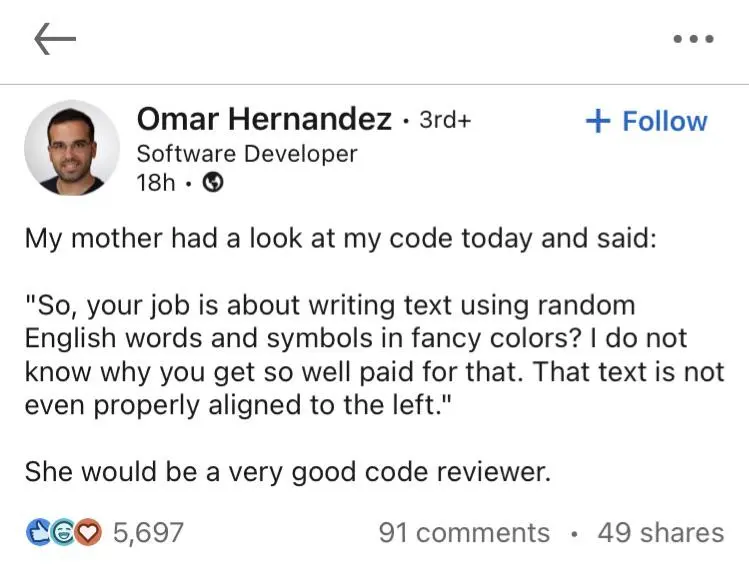
it makes just as little sense to me
it makes just as little sense to me


I really do love the fun IDE colors.
Does anyone else switch IDE themes depending on the project? Whenever I started a new project I would choose a new theme to go with it.
it makes just as little sense to me


I really do love the fun IDE colors.
Does anyone else switch IDE themes depending on the project? Whenever I started a new project I would choose a new theme to go with it.
My better half is convinced that my job is looking at and interacting with black windows. She can't figure out why I need high end computers when all I did is fiddle with the black windows.
Just dark mode for me. Though maybe I should try mixing it up with neon text colors.
Always dark mode. But some themes are like dark blue, or dark green.
One Dark Pro
Give gruvbox a shot! My absolute favourite color scheme. Here's an example of it in action in my config: link
I push buttons for a living. Computer buttons on my most productive days.
I only use monochrome (16 shades of gray)
I don't have any colors to suggest but I do have two fonts to recommend.
These two fonts just make things feel a little more human and whimsical in a way I can't fully explain and I love them.
Also, about color themes, never let anyone make fun of you for using a light theme. Sometimes they're better. It's not so simple as dark or light, some tools have awful light themes or awful dark themes.
Just some more font suggestions, these are not monospaced but just interesting fonts:
Great recommendations. I'm a fan of JetBrains Mono myself
I Like Input Sans for programming. iA Writer Quattro is similar to that. Now, I use for programming Recursive, a variable font with variable monospacedness among others. It has a configurator where all axes and features can be fixed for better compatibility.
Nope, it's all light theme with comic sans and small caps for me
And Comic Sans is missing small-caps versions of the letters ᴀᴄᴅᴇᴊᴋᴍɴᴏᴘᴏᴛᴜᴠᴡᴢ (which is most of them), which would put reading your code from hard to nightmare difficulty.
Don’t you mean Comic Mono you monster?
I prefer original Comic Sans. How Comic Mono has all characters forced to the same width makes it uglier and less readable, especially capital letters.
Dark mode with a darkish background on the whole IDE. That's how I enjoy it.
I use a modified version of an old hope
I do different IDE based on project type, does that count?
I like how JetBrains IDEs assign a color to every project, and the color is in the titlebar of the project.